Progettazione di abbigliamento
Realizzare abiti personalizzati con le griglie pixel
I progetti di abbigliamento necessitano di forme leggibili, tavolozze sobrie e bordi puliti. Una griglia di pixel ti aiuta a pianificare loghi, icone, strisce, stemmi e dettagli delle maglie prima di iniziare a copiarli nel gioco.
Verificato da Living the Grid editor testing - Ultimo aggiornamento
Apri il Creatore di griglieCosa tratta questa guida
Custom clothes pixel grids are small reference patterns for shirts, logos, badges, and outfit details in Tomodachi Life. They work best when the design uses bold shapes, a limited palette, and clean edges that still read clearly after the art is copied by hand.
Guide Images
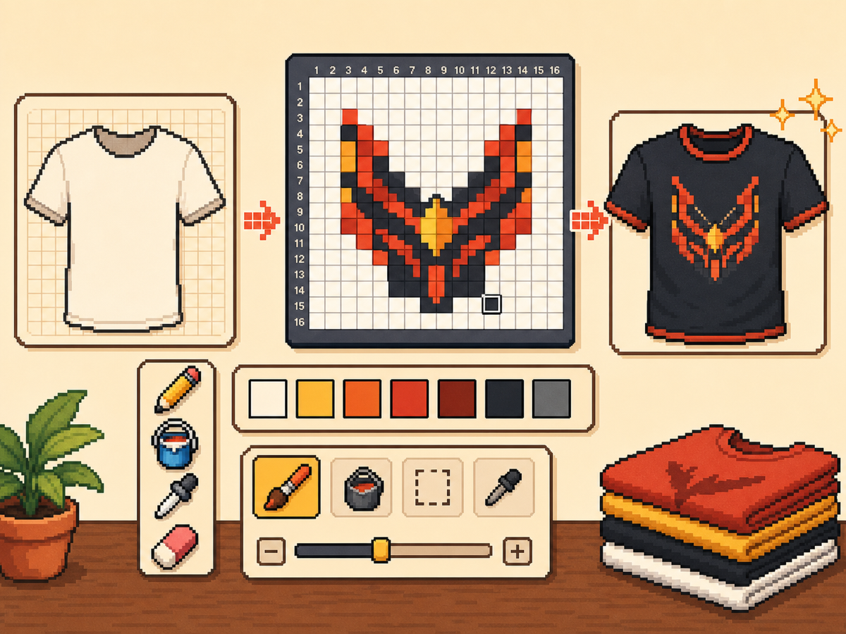
Flusso di lavoro passo dopo passo
- Inizia con un'idea di abbigliamento audace. Simboli semplici, segni di squadra, badge e motivi ad alto contrasto funzionano meglio dei piccoli dettagli fotografici.
- Utilizzare prima 24x24 o 32x32. Queste dimensioni mantengono leggibili i dettagli dell'abbigliamento senza trasformare il disegno in una lunga sessione di copia.
- Proteggi il contorno. I bordi puliti sono importanti sui vestiti perché piccoli errori fanno sembrare deformati i loghi e le icone. Correggi le cellule vaganti prima dell'esportazione.
- Limita la tavolozza. Utilizza meno colori per i modelli indossabili. I blocchi di colore di grandi dimensioni solitamente appaiono più nitidi rispetto ai gradienti complessi.
Scelte e compromessi sulla griglia
| Scelta | Ideale per | Compromesso |
|---|---|---|
| 16x16 | Tiny badges, sleeve marks, and simple symbols | Very quick, but only works for bold silhouettes. |
| 24x24 | Shirt icons, stripes, initials, and small outfit details | Good for wearable art that should not take long to copy. |
| 32x32 | Larger logos, character marks, and detailed clothing panels | More readable detail, but cleanup matters more. |
I migliori modelli di abbigliamento per Pixel Grids
I modelli di abbigliamento più forti utilizzano forme grandi e leggibili. Uno stemma di una maglietta con tre o quattro colori avrà solitamente un aspetto migliore di un'illustrazione dettagliata con molte sfumature.
Se stai convertendo un logo, ritaglialo strettamente attorno e prova sia 24x24 che 32x32 prima di impegnarti nel modello finale.
Come mantenere leggibili i vestiti
Controlla l'anteprima a dimensioni piccole. Se il disegno è ancora comprensibile nella tela di anteprima, ha maggiori possibilità di lavorare sugli abiti.
Evita di posizionare dettagli importanti sul bordo della griglia a meno che tu non sia sicuro che non verranno ritagliati o distorti dalla superficie del gioco.
Design Rules for Small Clothing Areas
Clothing art has less room for detail than posters or TV screens, so the best designs use one strong symbol rather than a full illustration. Think in terms of badges, stripes, initials, icons, or a single character mark.
Leave a little empty space around the design. A logo that touches the grid edge can look cramped after it is copied onto clothing, especially if the in-game surface curves or crops the artwork.
How to Test a Shirt Design Before Copying
Preview the grid at the size you expect to see in-game. If you cannot recognize the design when it is small, reduce colors, thicken the outline, or remove interior details before exporting.
Try a two-pass test: first export a simple 24x24 version, then compare it with a 32x32 version. Use the larger grid only if it adds readable information instead of extra noise.
Troubleshooting Clothing Edges
Jagged edges stand out on clothes because the design is usually seen as a single emblem. Clean the outer contour manually and remove stray pixels that sit just outside the main shape.
If diagonal lines look broken, use short stair-step patterns instead of scattered single cells. Consistent stair steps look intentional, while isolated pixels usually look like conversion mistakes.
Example Clothing Workflow
For a shirt badge, sketch the badge shape first, then add one internal symbol and one highlight color. If the design needs more than four or five colors to make sense, it may be better as a poster or TV screen grid.
For stripes or initials, copy the layout with a temporary high-contrast color before finalizing the palette. This makes spacing mistakes obvious and lets you correct the pattern before the real colors are in place.
Errori comuni da evitare
- Using photo detail on clothes. Clothing art is small. Replace photo texture with a few readable shapes before exporting.
- Ignoring edge safety. Important marks near the border may look clipped. Leave space around logos and badges.
- Adding too many shades. Complex gradients blur on clothing. Use strong contrast and fewer colors for sharper results.
Guide correlate
Domande frequenti
Qual è la dimensione della griglia migliore per i vestiti personalizzati?
Utilizza 24x24 per segni semplici e 32x32 per capi di abbigliamento più dettagliati. Utilizza 48x48 solo quando il design necessita di dettagli precisi.
La pixel art dei vestiti dovrebbe usare molti colori?
Di solito no. Una tavolozza limitata è più facile da copiare e rende i modelli di abbigliamento più nitidi.
Are photos good for custom clothes?
Photos usually need heavy simplification before they work on clothing. Convert the photo into a bold symbol or cropped face rather than trying to preserve every shade.
How much empty space should I leave?
Leave enough border space that the design does not touch the grid edge. This makes logos and badges feel cleaner when they are copied onto clothing.