Flusso di lavoro della tavolozza
Usare Palette House come un professionista
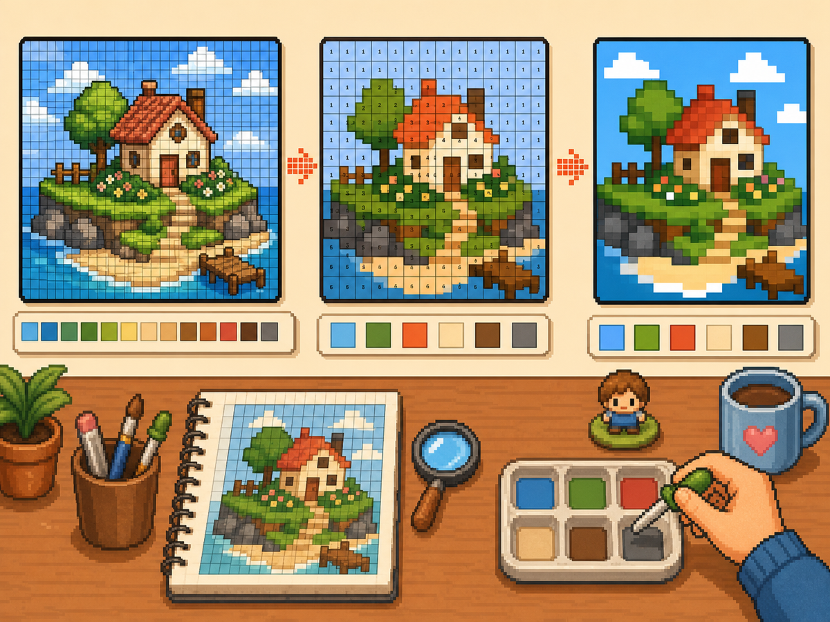
Palette House il lavoro diventa più semplice quando il disegno viene preparato come una griglia di pixel numerati. La griglia ti offre un piano per l'ordine dei colori, la copia riga per riga e la pulizia in modo da dedicare meno tempo a indovinare tra tonalità simili.
Verificato da Living the Grid editor testing - Ultimo aggiornamento
Apri il Creatore di griglieCosa tratta questa guida
Palette House is the in-game drawing workflow where Tomodachi Life pixel grids become usable art. A numbered grid turns the design into repeatable color instructions, helping you choose palette order, merge similar shades, and copy each row with fewer mistakes.
Guide Images
Flusso di lavoro passo dopo passo
- Esporta un modello numerato. Un modello numerato trasforma ogni cella della griglia in un'istruzione della tavolozza. Questo è il formato più semplice da seguire quando si ricostruisce un disegno a mano.
- Raggruppa colori simili. Copia prima le regioni più grandi, quindi passa alle sfumature più piccole. Ciò mantiene leggibile il design complessivo mentre lavori.
- Controlla spesso la silhouette. Rimpicciolisci o allontanati dal motivo dopo ogni passaggio di colore principale. Se la forma si legge chiaramente, i dettagli saranno più facili da posizionare.
- Usa colori ridotti per opere d'arte impegnative. Quando un motivo presenta troppi piccoli cambiamenti di tonalità, passa a meno colori e rigenera. Una tavolozza più semplice di solito appare più pulita nel gioco.
Scelte e compromessi sulla griglia
| Scelta | Ideale per | Compromesso |
|---|---|---|
| Exact colors | Small art with a few strong source colors | Closer to the image, but similar shades may be hard to tell apart. |
| Reduced palette | Photos, gradients, skin tones, and busy source images | Less exact, but faster and cleaner for manual copying. |
| Manual cleanup | Outlines, logos, clothes, and high-contrast icons | Takes extra editing time, but produces the clearest in-game result. |
Palette House Strategia del colore
Scegli i colori in base alla leggibilità prima e alla corrispondenza esatta poi. La pixel art spesso ha un aspetto migliore quando le sfumature vicine vengono unite in un set più piccolo.
Se la pelle, i vestiti o gli sfondi diventano confusi, riduci la tavolozza e aggiungi alcune luci manuali invece di mantenere tutti i colori di origine.
Errori comuni Palette House
L’errore più comune è iniziare dai piccoli dettagli. Disegna prima il contorno e i riempimenti grandi in modo che gli errori siano visibili subito.
Un altro errore è utilizzare una griglia troppo grande per un oggetto semplice. Se un risultato 48x48 sembra rumoroso, una griglia 32x32 più pulita potrebbe avere un aspetto migliore.
When to Merge Similar Colors
Merge colors when two swatches are hard to tell apart at normal viewing size. Exact source matching matters less than a design that reads clearly on the small in-game surface.
Skin tones, shadows, and soft gradients are the most common places to simplify. Pick one base color, one shadow, and one highlight before adding extra shades.
A Practical Copy Order
Copy the design in passes instead of treating every cell equally. First place the border and the largest blocks, then add the secondary colors, then finish with highlights, outlines, and single-cell corrections.
This pass-based method reduces rework. If a logo or face looks wrong after the first two passes, you can still fix the silhouette before the final details lock you into a messy shape.
When to Regenerate the Grid
Regenerate the pattern when cleanup would take longer than starting again. Warning signs include noisy backgrounds, dozens of one-cell color changes, unreadable eyes, or letters that break into specks.
Try one change at a time: crop tighter, lower the color count, switch from 48x48 to 32x32, or remove the background before uploading. Comparing two exports side by side is often faster than guessing.
Example Palette House Workflow
For a character face, begin with the hair outline and face shape, then fill skin and hair blocks before touching eyes or highlights. If the face still reads clearly after those first passes, the small details will have a stronger base.
For a logo, start with the outside silhouette and the most recognizable color. Add secondary colors only after the shape is correct. This keeps the design from drifting while you switch between palette swatches.
Errori comuni da evitare
- Starting with tiny details. Copy the outline and large color blocks first so shape problems appear before the pattern gets crowded.
- Trusting every matched color. Palette matching is a starting point. Merge shades that look identical on the game screen.
- Overusing dithering. Heavy dithering creates alternating cells that are slow to copy. Save it for smooth gradients.
Guide correlate
Domande frequenti
Dovrei usare tutti i colori della tavolozza generata?
No. Utilizza solo i colori che migliorano la leggibilità. L'unione di ombre vicine può rendere un design più facile da copiare e pulire nel gioco.
Il dithering è sempre meglio?
No. Il dithering morbido può aiutare i gradienti, ma il dithering pesante crea molte celle alternate che sono lente da copiare manualmente.
What should I copy first in Palette House?
Copy the outline and largest color blocks first. Add small highlights, texture, and single-cell details after the silhouette already reads correctly.
When should I use a smaller grid?
Use a smaller grid when a simple object becomes noisy at 48x48. A clean 32x32 pattern often looks better than a detailed grid full of hard-to-copy color changes.