Arredamento della camera
Creazione di poster e decorazioni murali
I poster e le decorazioni murali possono contenere più dettagli dei vestiti, ma necessitano comunque di una griglia pulita. I risultati migliori si ottengono ritagliando in modo preciso, scegliendo una dimensione della griglia che corrisponda al soggetto e semplificando i colori prima della copia.
Verificato da Living the Grid editor testing - Ultimo aggiornamento
Apri il Creatore di griglieCosa tratta questa guida
Poster and wall decoration pixel grids turn portraits, scenes, signs, and room art into structured Tomodachi Life copying guides. They can use more detail than clothing grids, but still need tight crops, readable contrast, simplified colors, and an export format that is practical to follow.
Guide Images
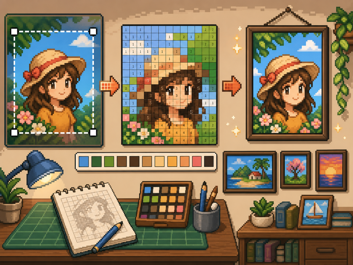
Flusso di lavoro passo dopo passo
- Ritaglia fino alla forma finale del poster. Rimuovi lo sfondo extra prima della conversione in modo che la griglia si concentri sul disegno e non sui margini vuoti.
- Prova 32x32 e 48x48. Utilizza 32x32 per poster in grassetto e 48x48 per ritratti, scene o disegni con dettagli simili a testo.
- Pulisci il rumore del colore. I poster spesso mostrano sfumature e ombre. Riduci le aree rumorose in modo che il modello finale sia pratico da copiare.
- Esporta entrambe le versioni. Utilizza il modello numerato per la copia e la griglia semplice come un rapido controllo visivo.
Scelte e compromessi sulla griglia
| Scelta | Ideale per | Compromesso |
|---|---|---|
| 24x24 | Simple signs, icons, and bold room decorations | Fast to copy, but not enough room for faces or text. |
| 32x32 | Most posters, portraits, and wall art with clear subjects | A strong balance between readable detail and effort. |
| 48x48 | Detailed scenes, portraits, and TV-like art panels | Best detail, but noisy source images require more cleanup. |
Preparazione dell'immagine del poster
Una buona fonte di poster ha un punto focale chiaro. Se l'immagine originale ha uno sfondo occupato, ritagliala o semplificala prima di caricarla.
Il testo è difficile da conservare con griglie di piccole dimensioni. Se il testo è importante, utilizza una griglia più grande o sostituisci il testo con una forma di blocco più semplice.
Suggerimenti per la pulizia delle decorazioni murali
Utilizza il selettore per campionare i colori vicini e ridipingere le celle isolate che non aiutano l'immagine. Il rumore isolato è uno dei modi più rapidi per far sembrare disordinato un poster.
Quando copi il modello, contrassegna le righe o i blocchi finiti fuori dal gioco in modo da non ripetere o saltare le celle.
Choosing a Poster Source Image
A poster can handle more detail than a shirt, but it still needs one clear focal point. Portraits, album-style covers, title cards, and simple room art usually work better than busy screenshots.
If the original image has text, decide whether the text really needs to be readable. Large block letters can survive at 48x48, but small captions usually become noise and should be removed or redrawn.
Grid Size Decision for Wall Art
Use 32x32 when the poster is built around one bold shape. Use 48x48 when the subject depends on facial features, room details, or a recognizable scene.
Do not choose 48x48 only because it feels more detailed. The larger grid adds 1,280 more cells than 32x32, so it is worth using only when the extra cells make the final image easier to recognize.
Copy Workflow for Larger Posters
For a poster-sized copy session, work in bands. Finish the top quarter, check the silhouette, then move to the next section. This keeps your place and prevents small row offsets from spreading through the whole design.
Keep the plain preview nearby while copying the numbered pattern. The preview helps you notice when a copied row is shifted, while the numbers help with exact color placement.
Example Poster Workflow
For a portrait poster, place the head shape, hair mass, and background color before adding eyes, mouth, or small shadows. If the face looks wrong at that stage, adjust the crop or grid size before investing time in details.
For a sign or title card, block out the largest letters first and simplify any lettering that breaks apart. A readable three-letter mark is better than a longer phrase that turns into scattered pixels.
Errori comuni da evitare
- Keeping tiny text. Small lettering usually breaks during conversion. Replace it with block shapes or use a larger grid.
- Leaving busy backgrounds. Background noise steals cells from the subject. Crop and simplify before using the creatore di griglie.
- Skipping the plain preview. Check the clean PNG before copying. If it is not readable without numbers, simplify the pattern.
Guide correlate
Domande frequenti
48x48 è la soluzione migliore per ogni poster?
No. Utilizza il formato 48x48 per poster dettagliati, ma i design più semplici spesso sembrano più puliti e richiedono meno tempo a 32x32.
Il testo piccolo può sopravvivere alla conversione?
Di solito no. Le lettere maiuscole grandi possono funzionare, ma il testo minuscolo dovrebbe essere semplificato o rimosso.
Should I remove the poster background?
Remove or simplify the background when it competes with the subject. A cleaner background gives the main shape more grid cells and makes the copy easier.
Why does my poster look noisy?
Poster noise usually comes from gradients, shadows, or busy backgrounds. Reduce the palette, repaint isolated cells, and check the plain preview before copying.