Clothing Design
Making Custom Clothes with Pixel Grids
Clothing designs need readable shapes, restrained palettes, and clean edges. A pixel grid helps you plan logos, icons, stripes, badges, and shirt details before you start copying them into the game.
Tested by Living the Grid editor testing - Last updated
Open the Grid MakerWhat This Guide Covers
Custom clothes pixel grids are small reference patterns for shirts, logos, badges, and outfit details in Tomodachi Life. They work best when the design uses bold shapes, a limited palette, and clean edges that still read clearly after the art is copied by hand.
Guide Images
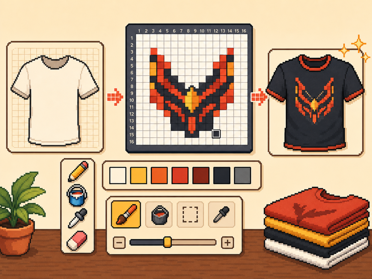
Step-by-Step Workflow
- Start with a bold clothing idea. Simple symbols, team-style marks, badges, and high-contrast patterns work better than tiny photo details.
- Use 24x24 or 32x32 first. These sizes keep clothing details readable without turning the design into a long copy session.
- Protect the outline. Clean edges matter on clothes because small errors make logos and icons look warped. Fix stray cells before exporting.
- Limit the palette. Use fewer colors for wearable designs. Large color blocks usually look sharper than complex gradients.
Grid Choices and Tradeoffs
| Choice | Best For | Tradeoff |
|---|---|---|
| 16x16 | Tiny badges, sleeve marks, and simple symbols | Very quick, but only works for bold silhouettes. |
| 24x24 | Shirt icons, stripes, initials, and small outfit details | Good for wearable art that should not take long to copy. |
| 32x32 | Larger logos, character marks, and detailed clothing panels | More readable detail, but cleanup matters more. |
Best Clothing Designs for Pixel Grids
The strongest clothing patterns use large readable shapes. A shirt emblem with three or four colors will usually look better than a detailed illustration with many shades.
If you are converting a logo, crop tightly around it and test both 24x24 and 32x32 before committing to the final pattern.
How to Keep Clothes Readable
Check the preview at small sizes. If the design is still understandable in the preview canvas, it has a better chance of working on clothing.
Avoid placing important details at the edge of the grid unless you are sure they will not be clipped or distorted by the in-game surface.
Design Rules for Small Clothing Areas
Clothing art has less room for detail than posters or TV screens, so the best designs use one strong symbol rather than a full illustration. Think in terms of badges, stripes, initials, icons, or a single character mark.
Leave a little empty space around the design. A logo that touches the grid edge can look cramped after it is copied onto clothing, especially if the in-game surface curves or crops the artwork.
How to Test a Shirt Design Before Copying
Preview the grid at the size you expect to see in-game. If you cannot recognize the design when it is small, reduce colors, thicken the outline, or remove interior details before exporting.
Try a two-pass test: first export a simple 24x24 version, then compare it with a 32x32 version. Use the larger grid only if it adds readable information instead of extra noise.
Troubleshooting Clothing Edges
Jagged edges stand out on clothes because the design is usually seen as a single emblem. Clean the outer contour manually and remove stray pixels that sit just outside the main shape.
If diagonal lines look broken, use short stair-step patterns instead of scattered single cells. Consistent stair steps look intentional, while isolated pixels usually look like conversion mistakes.
Example Clothing Workflow
For a shirt badge, sketch the badge shape first, then add one internal symbol and one highlight color. If the design needs more than four or five colors to make sense, it may be better as a poster or TV screen grid.
For stripes or initials, copy the layout with a temporary high-contrast color before finalizing the palette. This makes spacing mistakes obvious and lets you correct the pattern before the real colors are in place.
Common Mistakes to Avoid
- Using photo detail on clothes. Clothing art is small. Replace photo texture with a few readable shapes before exporting.
- Ignoring edge safety. Important marks near the border may look clipped. Leave space around logos and badges.
- Adding too many shades. Complex gradients blur on clothing. Use strong contrast and fewer colors for sharper results.
Related Guides
Frequently Asked Questions
What grid size is best for custom clothes?
Use 24x24 for simple marks and 32x32 for more detailed clothing art. Use 48x48 only when the design needs fine detail.
Should clothing pixel art use many colors?
Usually no. A limited palette is easier to copy and makes clothing designs look sharper.
Are photos good for custom clothes?
Photos usually need heavy simplification before they work on clothing. Convert the photo into a bold symbol or cropped face rather than trying to preserve every shade.
How much empty space should I leave?
Leave enough border space that the design does not touch the grid edge. This makes logos and badges feel cleaner when they are copied onto clothing.