Palette Workflow
Using the Palette House Like a Pro
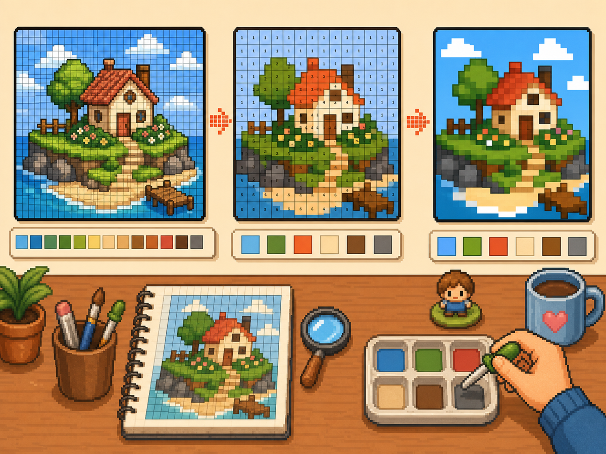
Palette House work gets easier when the design is prepared as a numbered pixel grid. The grid gives you a plan for color order, row-by-row copying, and cleanup so you spend less time guessing between similar shades.
Tested by Living the Grid editor testing - Last updated
Open the Grid MakerWhat This Guide Covers
Palette House is the in-game drawing workflow where Tomodachi Life pixel grids become usable art. A numbered grid turns the design into repeatable color instructions, helping you choose palette order, merge similar shades, and copy each row with fewer mistakes.
Guide Images
Step-by-Step Workflow
- Export a numbered pattern. A numbered pattern turns every grid cell into a palette instruction. This is the easiest format to follow when rebuilding a design by hand.
- Group similar colors. Copy large regions first, then move to smaller shades. This keeps the overall design readable while you work.
- Check the silhouette often. Zoom out or step back from the pattern after each major color pass. If the shape reads clearly, the details will be easier to place.
- Use reduced colors for busy art. When a pattern has too many tiny shade changes, switch to fewer colors and regenerate. A simpler palette usually looks cleaner in-game.
Grid Choices and Tradeoffs
| Choice | Best For | Tradeoff |
|---|---|---|
| Exact colors | Small art with a few strong source colors | Closer to the image, but similar shades may be hard to tell apart. |
| Reduced palette | Photos, gradients, skin tones, and busy source images | Less exact, but faster and cleaner for manual copying. |
| Manual cleanup | Outlines, logos, clothes, and high-contrast icons | Takes extra editing time, but produces the clearest in-game result. |
Palette House Color Strategy
Choose colors based on readability first and exact matching second. Pixel art often looks better when nearby shades are merged into a smaller set.
If skin, clothing, or backgrounds become muddy, reduce the palette and add a few manual highlights instead of keeping every source color.
Common Palette House Mistakes
The most common mistake is starting with tiny details. Draw the outline and large fills first so errors are visible early.
Another mistake is using a grid that is too large for a simple object. If a 48x48 result feels noisy, a cleaner 32x32 grid may look better.
When to Merge Similar Colors
Merge colors when two swatches are hard to tell apart at normal viewing size. Exact source matching matters less than a design that reads clearly on the small in-game surface.
Skin tones, shadows, and soft gradients are the most common places to simplify. Pick one base color, one shadow, and one highlight before adding extra shades.
A Practical Copy Order
Copy the design in passes instead of treating every cell equally. First place the border and the largest blocks, then add the secondary colors, then finish with highlights, outlines, and single-cell corrections.
This pass-based method reduces rework. If a logo or face looks wrong after the first two passes, you can still fix the silhouette before the final details lock you into a messy shape.
When to Regenerate the Grid
Regenerate the pattern when cleanup would take longer than starting again. Warning signs include noisy backgrounds, dozens of one-cell color changes, unreadable eyes, or letters that break into specks.
Try one change at a time: crop tighter, lower the color count, switch from 48x48 to 32x32, or remove the background before uploading. Comparing two exports side by side is often faster than guessing.
Example Palette House Workflow
For a character face, begin with the hair outline and face shape, then fill skin and hair blocks before touching eyes or highlights. If the face still reads clearly after those first passes, the small details will have a stronger base.
For a logo, start with the outside silhouette and the most recognizable color. Add secondary colors only after the shape is correct. This keeps the design from drifting while you switch between palette swatches.
Common Mistakes to Avoid
- Starting with tiny details. Copy the outline and large color blocks first so shape problems appear before the pattern gets crowded.
- Trusting every matched color. Palette matching is a starting point. Merge shades that look identical on the game screen.
- Overusing dithering. Heavy dithering creates alternating cells that are slow to copy. Save it for smooth gradients.
Related Guides
Frequently Asked Questions
Should I use every color from the generated palette?
No. Use only the colors that improve readability. Merging close shades can make a design easier to copy and cleaner in-game.
Is dithering always better?
No. Soft dithering can help gradients, but heavy dithering creates many alternating cells that are slow to copy manually.
What should I copy first in Palette House?
Copy the outline and largest color blocks first. Add small highlights, texture, and single-cell details after the silhouette already reads correctly.
When should I use a smaller grid?
Use a smaller grid when a simple object becomes noisy at 48x48. A clean 32x32 pattern often looks better than a detailed grid full of hard-to-copy color changes.