Room Decor
Creating Posters and Wall Decorations
Posters and wall decorations can carry more detail than clothing, but they still need a clean grid. The best results come from cropping tightly, choosing a grid size that matches the subject, and simplifying colors before copying.
Tested by Living the Grid editor testing - Last updated
Open the Grid MakerWhat This Guide Covers
Poster and wall decoration pixel grids turn portraits, scenes, signs, and room art into structured Tomodachi Life copying guides. They can use more detail than clothing grids, but still need tight crops, readable contrast, simplified colors, and an export format that is practical to follow.
Guide Images
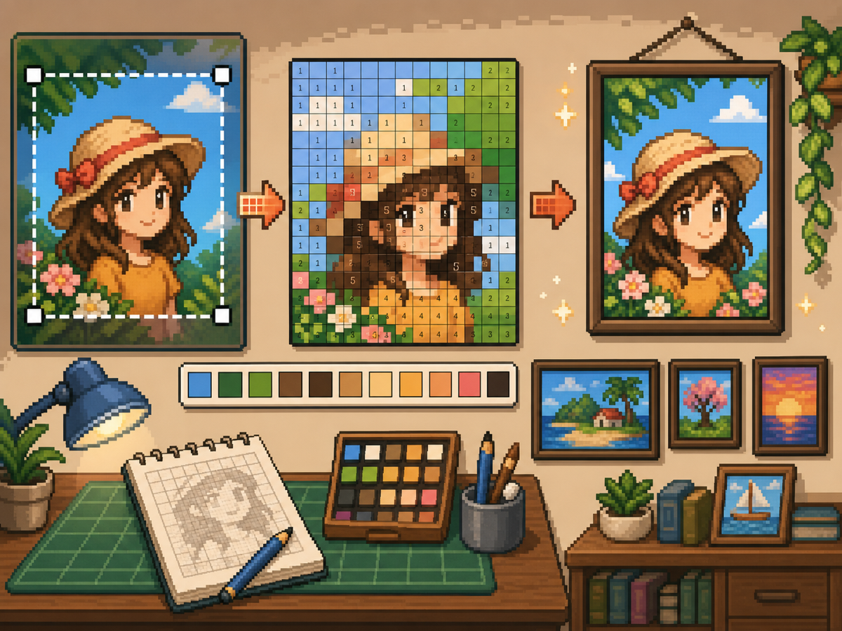
Step-by-Step Workflow
- Crop to the final poster shape. Remove extra background before conversion so the grid focuses on the artwork, not empty margins.
- Test 32x32 and 48x48. Use 32x32 for bold posters and 48x48 for portraits, scenes, or designs with text-like details.
- Clean up color noise. Posters often show gradients and shadows. Reduce noisy areas so the final pattern is practical to copy.
- Export both versions. Use the numbered pattern for copying and the plain grid as a quick visual check.
Grid Choices and Tradeoffs
| Choice | Best For | Tradeoff |
|---|---|---|
| 24x24 | Simple signs, icons, and bold room decorations | Fast to copy, but not enough room for faces or text. |
| 32x32 | Most posters, portraits, and wall art with clear subjects | A strong balance between readable detail and effort. |
| 48x48 | Detailed scenes, portraits, and TV-like art panels | Best detail, but noisy source images require more cleanup. |
Poster Image Preparation
A good poster source has a clear focal point. If the original image has a busy background, crop or simplify it before uploading.
Text is difficult to preserve at small grid sizes. If text matters, use a larger grid or replace the text with a simpler block shape.
Wall Decoration Cleanup Tips
Use the picker to sample nearby colors and repaint isolated cells that do not help the image. Isolated noise is one of the fastest ways to make a poster look messy.
When copying the pattern, mark finished rows or blocks outside the game so you do not repeat or skip cells.
Choosing a Poster Source Image
A poster can handle more detail than a shirt, but it still needs one clear focal point. Portraits, album-style covers, title cards, and simple room art usually work better than busy screenshots.
If the original image has text, decide whether the text really needs to be readable. Large block letters can survive at 48x48, but small captions usually become noise and should be removed or redrawn.
Grid Size Decision for Wall Art
Use 32x32 when the poster is built around one bold shape. Use 48x48 when the subject depends on facial features, room details, or a recognizable scene.
Do not choose 48x48 only because it feels more detailed. The larger grid adds 1,280 more cells than 32x32, so it is worth using only when the extra cells make the final image easier to recognize.
Copy Workflow for Larger Posters
For a poster-sized copy session, work in bands. Finish the top quarter, check the silhouette, then move to the next section. This keeps your place and prevents small row offsets from spreading through the whole design.
Keep the plain preview nearby while copying the numbered pattern. The preview helps you notice when a copied row is shifted, while the numbers help with exact color placement.
Example Poster Workflow
For a portrait poster, place the head shape, hair mass, and background color before adding eyes, mouth, or small shadows. If the face looks wrong at that stage, adjust the crop or grid size before investing time in details.
For a sign or title card, block out the largest letters first and simplify any lettering that breaks apart. A readable three-letter mark is better than a longer phrase that turns into scattered pixels.
Common Mistakes to Avoid
- Keeping tiny text. Small lettering usually breaks during conversion. Replace it with block shapes or use a larger grid.
- Leaving busy backgrounds. Background noise steals cells from the subject. Crop and simplify before using the grid maker.
- Skipping the plain preview. Check the clean PNG before copying. If it is not readable without numbers, simplify the pattern.
Related Guides
Frequently Asked Questions
Is 48x48 best for every poster?
No. Use 48x48 for detailed posters, but simpler designs often look cleaner and take less time at 32x32.
Can small text survive conversion?
Usually not. Large block letters can work, but tiny text should be simplified or removed.
Should I remove the poster background?
Remove or simplify the background when it competes with the subject. A cleaner background gives the main shape more grid cells and makes the copy easier.
Why does my poster look noisy?
Poster noise usually comes from gradients, shadows, or busy backgrounds. Reduce the palette, repaint isolated cells, and check the plain preview before copying.