パレット作業フロー
パレットハウスを使いこなす
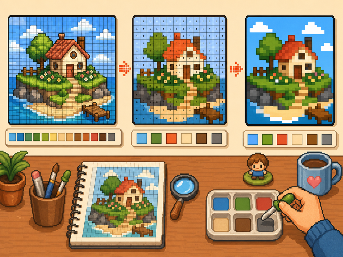
デザインを番号付きピクセルグリッドとして準備すると、パレットハウスでの作業が楽になります。色の順番、行ごとの写し方、仕上げの計画ができ、似た色で迷う時間を減らせます。
確認者 リビング・ザ・グリッド editor testing - 最終更新
グリッドメーカーを開くこのガイドでわかること
パレットハウス is the in-game drawing workflow where トモダチライフ pixel grids become usable art. A numbered grid turns the design into repeatable color instructions, helping you choose palette order, merge similar shades, and copy each row with fewer mistakes.
Guide Images
手順
- 番号付きパターンを書き出します。 番号付きパターンは各グリッドセルをパレット指示に変えます。手作業でデザインを再現する際に最も追いやすい形式です。
- 近い色をまとめます。 大きな領域から写し、その後で小さな色差へ進みます。作業中も全体のデザインを読みやすく保てます。
- シルエットをこまめに確認します。 大きな色を塗るたびにズームアウトするか少し離れて見ます。形がはっきり読めれば、細部も置きやすくなります。
- 情報量の多い絵には減色を使います。 細かい色差が多すぎるパターンは、色数を減らして再生成します。単純なパレットの方がゲーム内できれいに見えることが多いです。
グリッド選択とトレードオフ
| 選択 | 向いている用途 | トレードオフ |
|---|---|---|
| Exact colors | Small art with a few strong source colors | Closer to the image, but similar shades may be hard to tell apart. |
| Reduced palette | Photos, gradients, skin tones, and busy source images | Less exact, but faster and cleaner for manual copying. |
| Manual cleanup | Outlines, logos, clothes, and high-contrast icons | Takes extra editing time, but produces the clearest in-game result. |
パレットハウスの色戦略
まず読みやすさ、次に正確な色合わせを基準に選びます。近い色を小さなセットにまとめると、ピクセルアートはよく見えることが多いです。
肌、服、背景が濁る場合は、元画像のすべての色を残すのではなく、パレットを減らして手作業で少しハイライトを足します。
パレットハウスでよくあるミス
最も多いミスは小さな細部から始めることです。先に輪郭と大きな塗りを作ると、ミスに早く気づけます。
もう一つは、シンプルな物に大きすぎるグリッドを使うことです。48x48 がざらつく場合、きれいな 32x32 の方がよく見えることがあります。
When to Merge Similar Colors
Merge colors when two swatches are hard to tell apart at normal viewing size. Exact source matching matters less than a design that reads clearly on the small in-game surface.
Skin tones, shadows, and soft gradients are the most common places to simplify. Pick one base color, one shadow, and one highlight before adding extra shades.
A Practical Copy Order
Copy the design in passes instead of treating every cell equally. First place the border and the largest blocks, then add the secondary colors, then finish with highlights, outlines, and single-cell corrections.
This pass-based method reduces rework. If a logo or face looks wrong after the first two passes, you can still fix the silhouette before the final details lock you into a messy shape.
When to Regenerate the Grid
Regenerate the pattern when cleanup would take longer than starting again. Warning signs include noisy backgrounds, dozens of one-cell color changes, unreadable eyes, or letters that break into specks.
Try one change at a time: crop tighter, lower the color count, switch from 48x48 to 32x32, or remove the background before uploading. Comparing two exports side by side is often faster than guessing.
Example パレットハウス Workflow
For a character face, begin with the hair outline and face shape, then fill skin and hair blocks before touching eyes or highlights. If the face still reads clearly after those first passes, the small details will have a stronger base.
For a logo, start with the outside silhouette and the most recognizable color. Add secondary colors only after the shape is correct. This keeps the design from drifting while you switch between palette swatches.
避けたいよくあるミス
- Starting with tiny details. Copy the outline and large color blocks first so shape problems appear before the pattern gets crowded.
- Trusting every matched color. Palette matching is a starting point. Merge shades that look identical on the game screen.
- Overusing dithering. Heavy dithering creates alternating cells that are slow to copy. Save it for smooth gradients.
関連ガイド
よくある質問
生成されたパレットの色をすべて使うべき?
いいえ。読みやすさを高める色だけを使ってください。近い色をまとめると、写しやすく、ゲーム内でもきれいになります。
ディザリングは常に良い?
いいえ。弱いディザリングはグラデーションに役立ちますが、強いディザリングは交互のセルが増えて手作業で写すのに時間がかかります。
What should I copy first in パレットハウス?
Copy the outline and largest color blocks first. Add small highlights, texture, and single-cell details after the silhouette already reads correctly.
When should I use a smaller grid?
Use a smaller grid when a simple object becomes noisy at 48x48. A clean 32x32 pattern often looks better than a detailed grid full of hard-to-copy color changes.