部屋の装飾
ポスターと壁飾りを作る
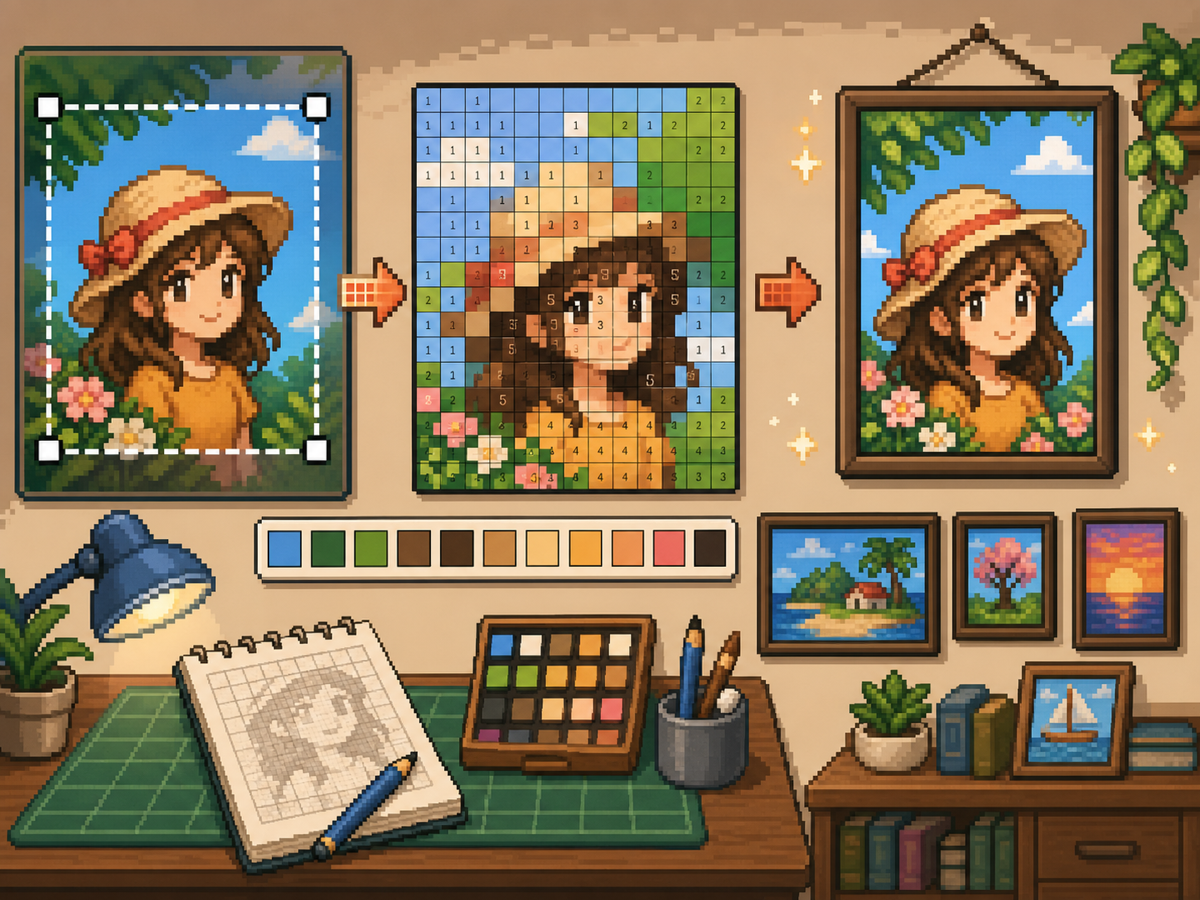
ポスターや壁飾りは服より多くの細部を入れられますが、やはりきれいなグリッドが必要です。タイトに切り抜き、被写体に合うグリッドサイズを選び、写す前に色を単純化すると良い結果になります。
確認者 リビング・ザ・グリッド editor testing - 最終更新
グリッドメーカーを開くこのガイドでわかること
Poster and wall decoration pixel grids turn portraits, scenes, signs, and room art into structured トモダチライフ copying guides. They can use more detail than clothing grids, but still need tight crops, readable contrast, simplified colors, and an export format that is practical to follow.
Guide Images
手順
- 最終的なポスター形状に切り抜きます。 変換前に余分な背景を取り除き、空白ではなく作品部分にグリッドが集中するようにします。
- 32x32 と 48x48 を試します。 太めのポスターには 32x32、ポートレート、シーン、文字に近い細部があるデザインには 48x48 を使います。
- 色ノイズを整理します。 ポスターにはグラデーションや影が多く出ます。最終パターンを写しやすくするため、ノイズの多い部分を減らします。
- 両方の形式を書き出します。 写すときは番号付きパターンを使い、通常グリッドは見た目確認用に使います。
グリッド選択とトレードオフ
| 選択 | 向いている用途 | トレードオフ |
|---|---|---|
| 24x24 | Simple signs, icons, and bold room decorations | Fast to copy, but not enough room for faces or text. |
| 32x32 | Most posters, portraits, and wall art with clear subjects | A strong balance between readable detail and effort. |
| 48x48 | Detailed scenes, portraits, and TV-like art panels | Best detail, but noisy source images require more cleanup. |
ポスター画像の準備
良いポスター素材には明確な焦点があります。元画像の背景が複雑な場合は、アップロード前に切り抜くか単純化します。
小さなグリッドでは文字を保つのが難しいです。文字が重要なら、大きめのグリッドを使うか、より単純なブロック形状に置き換えます。
壁飾りの仕上げのコツ
スポイトで近い色を取り、画像に役立たない孤立セルを塗り直します。孤立したノイズはポスターを雑に見せる大きな原因です。
パターンを写すときは、ゲーム外で完了した行やブロックに印を付けると、同じセルを繰り返したり飛ばしたりしにくくなります。
Choosing a Poster Source Image
A poster can handle more detail than a shirt, but it still needs one clear focal point. Portraits, album-style covers, title cards, and simple room art usually work better than busy screenshots.
If the original image has text, decide whether the text really needs to be readable. Large block letters can survive at 48x48, but small captions usually become noise and should be removed or redrawn.
Grid Size Decision for Wall Art
Use 32x32 when the poster is built around one bold shape. Use 48x48 when the subject depends on facial features, room details, or a recognizable scene.
Do not choose 48x48 only because it feels more detailed. The larger grid adds 1,280 more cells than 32x32, so it is worth using only when the extra cells make the final image easier to recognize.
Copy Workflow for Larger Posters
For a poster-sized copy session, work in bands. Finish the top quarter, check the silhouette, then move to the next section. This keeps your place and prevents small row offsets from spreading through the whole design.
Keep the plain preview nearby while copying the numbered pattern. The preview helps you notice when a copied row is shifted, while the numbers help with exact color placement.
Example Poster Workflow
For a portrait poster, place the head shape, hair mass, and background color before adding eyes, mouth, or small shadows. If the face looks wrong at that stage, adjust the crop or grid size before investing time in details.
For a sign or title card, block out the largest letters first and simplify any lettering that breaks apart. A readable three-letter mark is better than a longer phrase that turns into scattered pixels.
避けたいよくあるミス
- Keeping tiny text. Small lettering usually breaks during conversion. Replace it with block shapes or use a larger grid.
- Leaving busy backgrounds. Background noise steals cells from the subject. Crop and simplify before using the グリッドメーカー.
- Skipping the plain preview. Check the clean PNG before copying. If it is not readable without numbers, simplify the pattern.
関連ガイド
よくある質問
すべてのポスターに 48x48 が最適?
いいえ。細かいポスターには 48x48 を使いますが、シンプルなデザインは 32x32 の方がきれいで時間も少なく済むことが多いです。
小さな文字は変換後も残りますか?
通常は残りません。大きなブロック文字なら使えますが、小さな文字は単純化するか削除してください。
Should I remove the poster background?
Remove or simplify the background when it competes with the subject. A cleaner background gives the main shape more grid cells and makes the copy easier.
Why does my poster look noisy?
Poster noise usually comes from gradients, shadows, or busy backgrounds. Reduce the palette, repaint isolated cells, and check the plain preview before copying.