Diseño de ropa
Hacer ropa personalizada con cuadrículas de píxeles
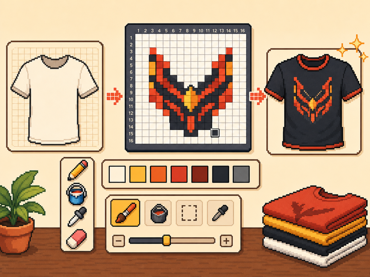
Los diseños de ropa necesitan formas legibles, paletas sobrias y bordes limpios. Una cuadrícula de píxeles te ayuda a planificar logotipos, íconos, rayas, insignias y detalles de camisetas antes de comenzar a copiarlos en el juego.
Revisado por Living the Grid editor testing - Última actualización
Abra el creador de cuadrículasQué cubre esta guía
Custom clothes pixel grids are small reference patterns for shirts, logos, badges, and outfit details in Tomodachi Life. They work best when the design uses bold shapes, a limited palette, and clean edges that still read clearly after the art is copied by hand.
Guide Images
Flujo de trabajo paso a paso
- Comience con una idea de ropa atrevida. Los símbolos simples, las marcas de estilo de equipo, las insignias y los patrones de alto contraste funcionan mejor que los pequeños detalles fotográficos.
- Utilice primero 24x24 o 32x32. Estos tamaños mantienen los detalles de la ropa legibles sin convertir el diseño en una larga sesión de copia.
- Protege el contorno. Los bordes limpios son importantes en la ropa porque los pequeños errores hacen que los logotipos e íconos parezcan deformados. Repare las celdas perdidas antes de exportar.
- Limita la paleta. Utilice menos colores para diseños portátiles. Los bloques de color grandes suelen verse más nítidos que los degradados complejos.
Elecciones y compensaciones de la red
| Opción | Mejor para | Compensación |
|---|---|---|
| 16x16 | Tiny badges, sleeve marks, and simple symbols | Very quick, but only works for bold silhouettes. |
| 24x24 | Shirt icons, stripes, initials, and small outfit details | Good for wearable art that should not take long to copy. |
| 32x32 | Larger logos, character marks, and detailed clothing panels | More readable detail, but cleanup matters more. |
Los mejores diseños de ropa para Pixel Grids
Los patrones de ropa más fuertes utilizan formas grandes y legibles. Un emblema de camiseta con tres o cuatro colores normalmente quedará mejor que una ilustración detallada con muchos tonos.
Si está convirtiendo un logotipo, recórtelo bien y pruebe tanto 24x24 como 32x32 antes de comprometerse con el patrón final.
Cómo mantener la ropa legible
Consulta la vista previa en tamaños pequeños. Si el diseño aún es comprensible en el lienzo de vista previa, tiene más posibilidades de funcionar en la ropa.
Evite colocar detalles importantes en el borde de la cuadrícula a menos que esté seguro de que la superficie del juego no los recortará ni los distorsionará.
Design Rules for Small Clothing Areas
Clothing art has less room for detail than posters or TV screens, so the best designs use one strong symbol rather than a full illustration. Think in terms of badges, stripes, initials, icons, or a single character mark.
Leave a little empty space around the design. A logo that touches the grid edge can look cramped after it is copied onto clothing, especially if the in-game surface curves or crops the artwork.
How to Test a Shirt Design Before Copying
Preview the grid at the size you expect to see in-game. If you cannot recognize the design when it is small, reduce colors, thicken the outline, or remove interior details before exporting.
Try a two-pass test: first export a simple 24x24 version, then compare it with a 32x32 version. Use the larger grid only if it adds readable information instead of extra noise.
Troubleshooting Clothing Edges
Jagged edges stand out on clothes because the design is usually seen as a single emblem. Clean the outer contour manually and remove stray pixels that sit just outside the main shape.
If diagonal lines look broken, use short stair-step patterns instead of scattered single cells. Consistent stair steps look intentional, while isolated pixels usually look like conversion mistakes.
Example Clothing Workflow
For a shirt badge, sketch the badge shape first, then add one internal symbol and one highlight color. If the design needs more than four or five colors to make sense, it may be better as a poster or TV screen grid.
For stripes or initials, copy the layout with a temporary high-contrast color before finalizing the palette. This makes spacing mistakes obvious and lets you correct the pattern before the real colors are in place.
Errores comunes a evitar
- Using photo detail on clothes. Clothing art is small. Replace photo texture with a few readable shapes before exporting.
- Ignoring edge safety. Important marks near the border may look clipped. Leave space around logos and badges.
- Adding too many shades. Complex gradients blur on clothing. Use strong contrast and fewer colors for sharper results.
Guías relacionadas
Preguntas frecuentes
¿Qué tamaño de cuadrícula es mejor para ropa personalizada?
Utilice 24x24 para marcas simples y 32x32 para diseños de ropa más detallados. Utilice 48x48 sólo cuando el diseño necesite detalles finos.
¿El pixel art de ropa debería usar muchos colores?
Generalmente no. Una paleta limitada es más fácil de copiar y hace que los diseños de ropa se vean más nítidos.
Are photos good for custom clothes?
Photos usually need heavy simplification before they work on clothing. Convert the photo into a bold symbol or cropped face rather than trying to preserve every shade.
How much empty space should I leave?
Leave enough border space that the design does not touch the grid edge. This makes logos and badges feel cleaner when they are copied onto clothing.