Декор Комнаты
Создание плакатов и настенных украшений
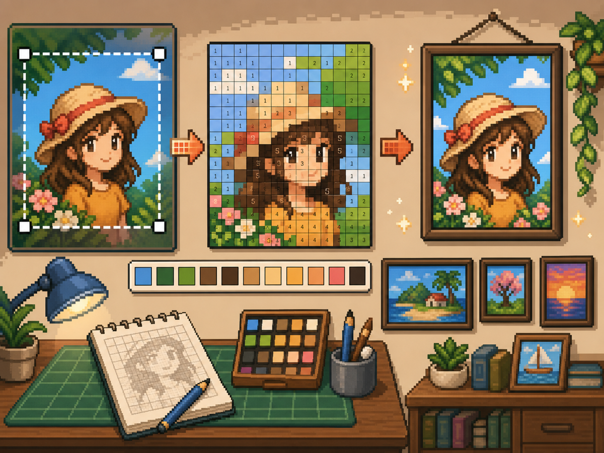
Плакаты и настенные украшения могут содержать больше деталей, чем одежда, но им все равно нужна чистая сетка. Наилучшие результаты достигаются при плотной обрезке, выборе размера сетки, соответствующего объекту, и упрощении цветов перед копированием.
Проверено Living the Grid editor testing - Последнее обновление
Откройте создатель сеткиЧто охватывает это руководство
Poster and wall decoration pixel grids turn portraits, scenes, signs, and room art into structured Tomodachi Life copying guides. They can use more detail than clothing grids, but still need tight crops, readable contrast, simplified colors, and an export format that is practical to follow.
Guide Images
Пошаговый рабочий процесс
- Обрежьте до окончательной формы плаката. Перед преобразованием удалите лишний фон, чтобы сетка фокусировалась на изображении, а не на пустых полях.
- Тест 32х32 и 48х48. Используйте размер 32x32 для ярких плакатов и 48x48 для портретов, сцен или рисунков с текстовыми деталями.
- Очистите цветовой шум. Плакаты часто показывают градиенты и тени. Уменьшите шумные области, чтобы окончательный рисунок было удобно копировать.
- Экспортируйте обе версии. Используйте пронумерованный шаблон для копирования и простую сетку для быстрой визуальной проверки.
Выбор сетки и компромиссы
| Вариант | Лучшее для | Компромисс |
|---|---|---|
| 24x24 | Simple signs, icons, and bold room decorations | Fast to copy, but not enough room for faces or text. |
| 32x32 | Most posters, portraits, and wall art with clear subjects | A strong balance between readable detail and effort. |
| 48x48 | Detailed scenes, portraits, and TV-like art panels | Best detail, but noisy source images require more cleanup. |
Подготовка изображения для плаката
Хороший источник плаката имеет четкую фокусную точку. Если исходное изображение имеет насыщенный фон, обрежьте или упростите его перед загрузкой.
Текст трудно сохранить при небольших размерах сетки. Если текст имеет значение, используйте сетку большего размера или замените текст более простой формой блока.
Советы по уборке настенных украшений
Используйте инструмент выбора, чтобы выбрать близлежащие цвета и перекрасить отдельные ячейки, которые не помогают изображению. Изолированный шум — один из самых быстрых способов придать плакату беспорядочный вид.
Копируя узор, отмечайте готовые ряды или блоки вне игры, чтобы не повторять и не пропускать ячейки.
Choosing a Poster Source Image
A poster can handle more detail than a shirt, but it still needs one clear focal point. Portraits, album-style covers, title cards, and simple room art usually work better than busy screenshots.
If the original image has text, decide whether the text really needs to be readable. Large block letters can survive at 48x48, but small captions usually become noise and should be removed or redrawn.
Grid Size Decision for Wall Art
Use 32x32 when the poster is built around one bold shape. Use 48x48 when the subject depends on facial features, room details, or a recognizable scene.
Do not choose 48x48 only because it feels more detailed. The larger grid adds 1,280 more cells than 32x32, so it is worth using only when the extra cells make the final image easier to recognize.
Copy Workflow for Larger Posters
For a poster-sized copy session, work in bands. Finish the top quarter, check the silhouette, then move to the next section. This keeps your place and prevents small row offsets from spreading through the whole design.
Keep the plain preview nearby while copying the numbered pattern. The preview helps you notice when a copied row is shifted, while the numbers help with exact color placement.
Example Poster Workflow
For a portrait poster, place the head shape, hair mass, and background color before adding eyes, mouth, or small shadows. If the face looks wrong at that stage, adjust the crop or grid size before investing time in details.
For a sign or title card, block out the largest letters first and simplify any lettering that breaks apart. A readable three-letter mark is better than a longer phrase that turns into scattered pixels.
Распространенные ошибки, которых следует избегать
- Keeping tiny text. Small lettering usually breaks during conversion. Replace it with block shapes or use a larger grid.
- Leaving busy backgrounds. Background noise steals cells from the subject. Crop and simplify before using the создатель сетки.
- Skipping the plain preview. Check the clean PNG before copying. If it is not readable without numbers, simplify the pattern.
Связанные руководства
Часто задаваемые вопросы
Является ли размер 48x48 лучшим для любого постера?
Нет. Используйте размер 48x48 для детальных плакатов, но более простые проекты часто выглядят чище и требуют меньше времени при размере 32x32.
Может ли мелкий текст пережить преобразование?
Обычно нет. Большие печатные буквы могут подойти, но мелкий текст следует упростить или удалить.
Should I remove the poster background?
Remove or simplify the background when it competes with the subject. A cleaner background gives the main shape more grid cells and makes the copy easier.
Why does my poster look noisy?
Poster noise usually comes from gradients, shadows, or busy backgrounds. Reduce the palette, repaint isolated cells, and check the plain preview before copying.