服装设计
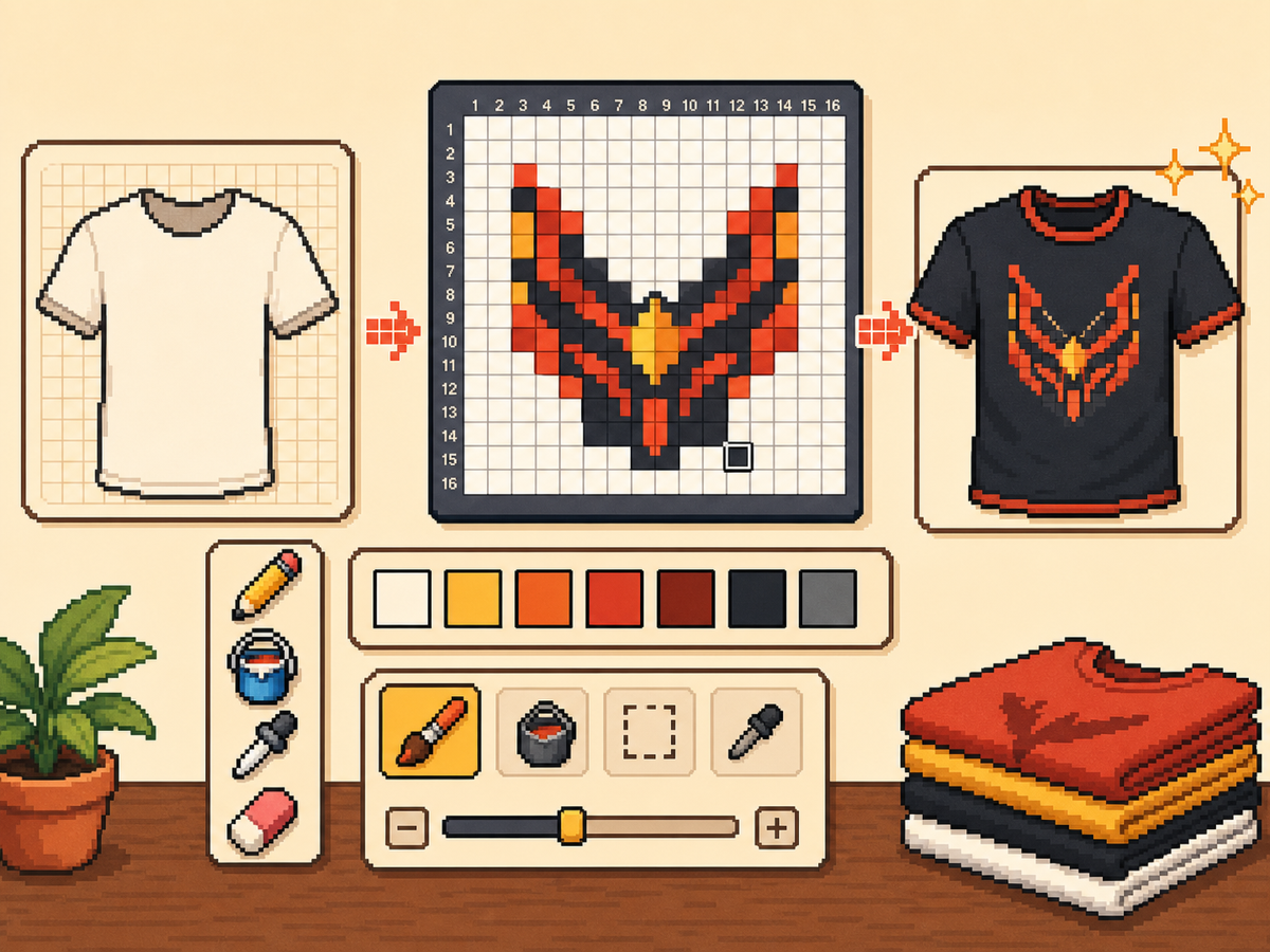
用像素网格制作自定义服装
服装设计需要易读形状、克制配色和干净边缘。像素网格能帮助你在复制进游戏前规划标志、图标、条纹、徽章和上衣细节。
审查者 网格生活 editor testing - 最后更新
打开网格制作器本指南涵盖内容
Custom clothes pixel grids are small reference patterns for shirts, logos, badges, and outfit details in 朋友生活. They work best when the design uses bold shapes, a limited palette, and clean edges that still read clearly after the art is copied by hand.
Guide Images
分步流程
- 从醒目的服装想法开始。 简单符号、队徽风标记、徽章和高对比图案,比微小照片细节更适合。
- 先使用 24x24 或 32x32。 这些尺寸能保持服装细节可读,同时不会让复制过程过长。
- 保护轮廓。 服装上干净边缘很重要,因为小错误会让标志和图标变形。导出前请修复零散格子。
- 限制颜色数量。 可穿戴设计请使用更少颜色。大色块通常比复杂渐变更清晰。
网格选择与取舍
| 选择 | 适合用途 | 取舍 |
|---|---|---|
| 16x16 | Tiny badges, sleeve marks, and simple symbols | Very quick, but only works for bold silhouettes. |
| 24x24 | Shirt icons, stripes, initials, and small outfit details | Good for wearable art that should not take long to copy. |
| 32x32 | Larger logos, character marks, and detailed clothing panels | More readable detail, but cleanup matters more. |
最适合像素网格的服装设计
最有效的服装图案使用大而清晰的形状。三四种颜色的上衣徽标通常比有许多色阶的细致插画更好看。
如果转换标志,请紧贴标志裁剪,并在确定最终图案前测试 24x24 和 32x32。
如何保持服装图案清晰
在小尺寸下检查预览。如果设计在预览画布中仍然可理解,它在服装上成功的概率更高。
除非确认游戏内表面不会裁切或扭曲,否则不要把重要细节放在网格边缘。
Design Rules for Small Clothing Areas
Clothing art has less room for detail than posters or TV screens, so the best designs use one strong symbol rather than a full illustration. Think in terms of badges, stripes, initials, icons, or a single character mark.
Leave a little empty space around the design. A logo that touches the grid edge can look cramped after it is copied onto clothing, especially if the in-game surface curves or crops the artwork.
How to Test a Shirt Design Before Copying
Preview the grid at the size you expect to see in-game. If you cannot recognize the design when it is small, reduce colors, thicken the outline, or remove interior details before exporting.
Try a two-pass test: first export a simple 24x24 version, then compare it with a 32x32 version. Use the larger grid only if it adds readable information instead of extra noise.
Troubleshooting Clothing Edges
Jagged edges stand out on clothes because the design is usually seen as a single emblem. Clean the outer contour manually and remove stray pixels that sit just outside the main shape.
If diagonal lines look broken, use short stair-step patterns instead of scattered single cells. Consistent stair steps look intentional, while isolated pixels usually look like conversion mistakes.
Example Clothing Workflow
For a shirt badge, sketch the badge shape first, then add one internal symbol and one highlight color. If the design needs more than four or five colors to make sense, it may be better as a poster or TV screen grid.
For stripes or initials, copy the layout with a temporary high-contrast color before finalizing the palette. This makes spacing mistakes obvious and lets you correct the pattern before the real colors are in place.
需要避免的常见错误
- Using photo detail on clothes. Clothing art is small. Replace photo texture with a few readable shapes before exporting.
- Ignoring edge safety. Important marks near the border may look clipped. Leave space around logos and badges.
- Adding too many shades. Complex gradients blur on clothing. Use strong contrast and fewer colors for sharper results.
相关指南
常见问题
自定义服装最适合哪种网格尺寸?
简单标记使用 24x24,更详细的服装图案使用 32x32。只有需要精细细节时才使用 48x48。
服装像素画应该使用很多颜色吗?
通常不需要。有限调色板更容易复制,也会让服装设计更清晰。
Are photos good for custom clothes?
Photos usually need heavy simplification before they work on clothing. Convert the photo into a bold symbol or cropped face rather than trying to preserve every shade.
How much empty space should I leave?
Leave enough border space that the design does not touch the grid edge. This makes logos and badges feel cleaner when they are copied onto clothing.