房间装饰
制作海报和墙面装饰
海报和墙面装饰可以承载比服装更多的细节,但仍然需要干净网格。最佳结果来自紧密裁剪、选择匹配主体的网格尺寸,并在复制前简化颜色。
审查者 网格生活 editor testing - 最后更新
打开网格制作器本指南涵盖内容
Poster and wall decoration pixel grids turn portraits, scenes, signs, and room art into structured 朋友生活 copying guides. They can use more detail than clothing grids, but still need tight crops, readable contrast, simplified colors, and an export format that is practical to follow.
Guide Images
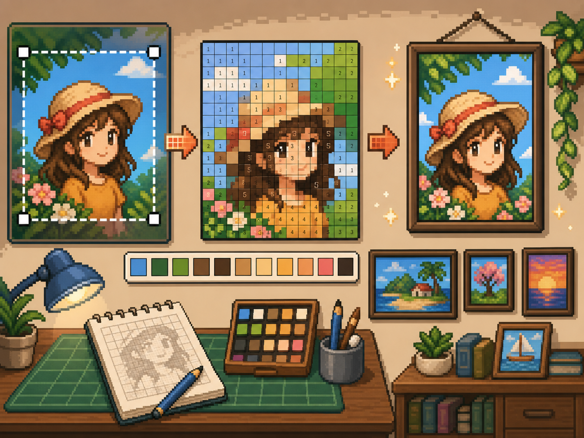
分步流程
- 裁剪成最终海报形状。 转换前去掉多余背景,让网格集中在图像内容上,而不是空白边缘。
- 测试 32x32 和 48x48。 醒目海报使用 32x32,肖像、场景或带类文字细节的设计使用 48x48。
- 清理颜色噪点。 海报常包含渐变和阴影。减少噪点区域,让最终图案更适合手动复制。
- 同时导出两个版本。 复制时使用编号图案,快速视觉检查时使用普通网格。
网格选择与取舍
| 选择 | 适合用途 | 取舍 |
|---|---|---|
| 24x24 | Simple signs, icons, and bold room decorations | Fast to copy, but not enough room for faces or text. |
| 32x32 | Most posters, portraits, and wall art with clear subjects | A strong balance between readable detail and effort. |
| 48x48 | Detailed scenes, portraits, and TV-like art panels | Best detail, but noisy source images require more cleanup. |
海报图片准备
好的海报素材有明确焦点。如果原图背景复杂,请在上传前裁剪或简化。
小网格很难保留文字。如果文字重要,请使用更大网格,或把文字替换成更简单的块状形状。
墙面装饰清理技巧
用取色工具采样相近颜色,并重画对图像无帮助的孤立格子。孤立噪点最容易让海报显得杂乱。
复制图案时,在游戏外标记已完成的行或区块,避免重复或跳过格子。
Choosing a Poster Source Image
A poster can handle more detail than a shirt, but it still needs one clear focal point. Portraits, album-style covers, title cards, and simple room art usually work better than busy screenshots.
If the original image has text, decide whether the text really needs to be readable. Large block letters can survive at 48x48, but small captions usually become noise and should be removed or redrawn.
Grid Size Decision for Wall Art
Use 32x32 when the poster is built around one bold shape. Use 48x48 when the subject depends on facial features, room details, or a recognizable scene.
Do not choose 48x48 only because it feels more detailed. The larger grid adds 1,280 more cells than 32x32, so it is worth using only when the extra cells make the final image easier to recognize.
Copy Workflow for Larger Posters
For a poster-sized copy session, work in bands. Finish the top quarter, check the silhouette, then move to the next section. This keeps your place and prevents small row offsets from spreading through the whole design.
Keep the plain preview nearby while copying the numbered pattern. The preview helps you notice when a copied row is shifted, while the numbers help with exact color placement.
Example Poster Workflow
For a portrait poster, place the head shape, hair mass, and background color before adding eyes, mouth, or small shadows. If the face looks wrong at that stage, adjust the crop or grid size before investing time in details.
For a sign or title card, block out the largest letters first and simplify any lettering that breaks apart. A readable three-letter mark is better than a longer phrase that turns into scattered pixels.
需要避免的常见错误
- Keeping tiny text. Small lettering usually breaks during conversion. Replace it with block shapes or use a larger grid.
- Leaving busy backgrounds. Background noise steals cells from the subject. Crop and simplify before using the 网格制作器.
- Skipping the plain preview. Check the clean PNG before copying. If it is not readable without numbers, simplify the pattern.
相关指南
常见问题
每张海报都适合 48x48 吗?
不是。细节海报可用 48x48,但简单设计在 32x32 下往往更干净,也更省时间。
小文字能在转换后保留下来吗?
通常不能。大块字母可以尝试,但小文字应简化或移除。
Should I remove the poster background?
Remove or simplify the background when it competes with the subject. A cleaner background gives the main shape more grid cells and makes the copy easier.
Why does my poster look noisy?
Poster noise usually comes from gradients, shadows, or busy backgrounds. Reduce the palette, repaint isolated cells, and check the plain preview before copying.